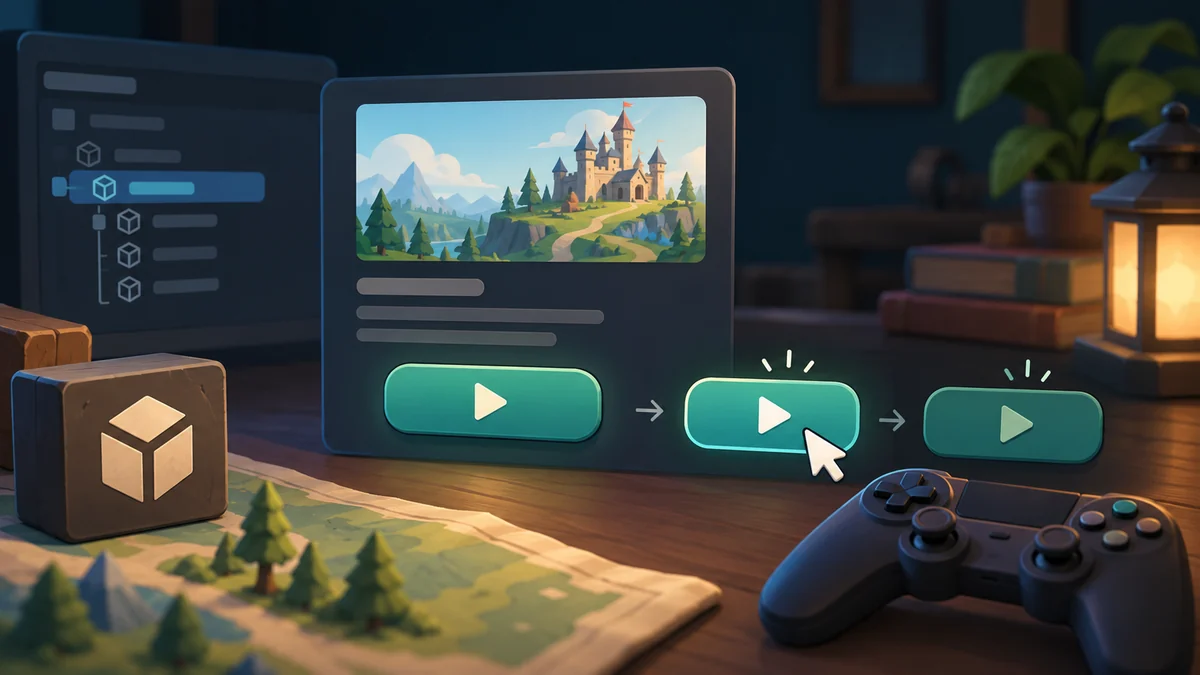
What does the button say before a tap?
A useful button tells someone what happens next and acknowledges their action. Layout, label and state work together. A start control needs different presentation while it is ready, disabled or waiting; a decorative shape alone cannot explain those differences.
A friendly label such as “Let’s go” may still leave people unsure whether it starts a match or opens another page. Place the start button beside the game name and a short explanation for this exercise. Its shape and size should make it findable among decoration. Beginners sometimes tune shadows and glow before choosing a label. Establish the destination and placement first, then make the appearance suit the game. A polished control is useful only when people understand what selecting it will do.
Observe feedback in its actual screen
Show a start button in ready, waiting and unavailable states. Ask a newcomer to explain what each state means before clicking. If they cannot tell whether the game accepted their touch, add acknowledgement. If they cannot tell why it is unavailable, add context. A short label and a clear state often answer more than a larger decorative frame.
The first tap needs visible acknowledgment. If preparation takes time, show waiting on the button or nearby so the player does not repeatedly tap for reassurance. A disabled control also needs an understandable reason; unexplained gray styling can resemble a defect. Unity UI has both presentation and update costs. Its official guidance discusses Canvas and layout work, but begin this exercise by making action, waiting and completion clear rather than applying speculative optimization.
Three states for one control
Ask two people to find the button and explain their expected outcome. Show ready, waiting and unavailable states separately. Record interpretations apart from style preferences: “I thought it buys something” concerns meaning, while disliking blue concerns taste. Color alone is insufficient for distinguishing states; brief text or a waiting indicator can help. The exercise ends with a control that communicates an accurate promise in each state, rather than an attractive still image.
Further reading: Unity: UI performance guidance
For a related example, read Dalo’s Main Menu: A Clear Route to the Table.