After the table came the entrance
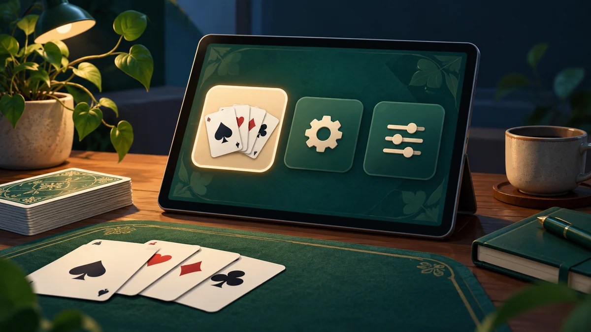
Once Hokm was playable, Dalo still needed a clear route into the game. Until then, most of my attention had gone to cards, rules and bots. I moved on to the main menu to bring the project’s areas together: game selection, settings, the shop and navigation back. In Dev Log 10, I showed the initial layout and its different sections. For me, that stage was mainly about building the interface’s structure. I needed to establish where each screen belonged and how the player would reach the table before getting into other details.
A simple appearance for a clear choice
For the menu’s appearance, I wanted to keep the feeling of a card game and make choices straightforward. Someone opening the application probably wants to choose a game; they do not need every part of the project presented at once. Selecting a game, opening settings and visiting the shop each have their own purpose. I tried to keep those purposes visible in the layout. I also used GPT to help turn visual ideas into an initial design. My focus was programming and connecting the pieces, so I did not want producing artwork to consume the entire stage.
Connecting the menu to later systems
The menu became more than a starting image. It was a connection point for systems I built later. After the initial interface, I worked on the coin economy, followed by skins and backgrounds. The shop and customization screen therefore needed to connect to actual information from those systems. Viewing an item, owning it and selecting it are three different states. If the screen does not make that distinction clear, even a correctly functioning system can confuse the player. After building the underlying parts, I returned to see how these states would come together in the menu experience.
From “it works” to “where do I go?”
This stage changed how I looked at Dalo. Previously, I mainly asked whether a hand worked from beginning to end. Now I was asking how someone reached that hand and where they went afterward. An attractive screen is useful when the next choice is understandable. That perspective stayed with the project through customization and Persian and English text. This article describes building the menu; one layout does not solve every interface problem. Visit the Dalo page to see the collection that the menu connects. Each game and system represents a stage in the same development path.